
The Best Ad Placement for WordPress (2026)
Best ad placement WordPress guide for 2026: layouts, above-the-fold, in-content, sidebar, mobile, and RPM tradeoffs.
The best ad placement WordPress setup is usually a balanced layout: one strong above-the-fold unit, in-content ads spaced through the article, and a sticky mobile or desktop position only if it does not hurt usability. For most publishers, that beats cramming ads into every open space. If you want the broader framework first, start with our display ad monetization guide, then use this page to tune your wordpress ad placement for RPM without wrecking engagement.
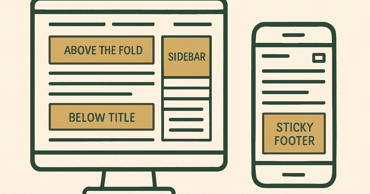
As of 2026, approximately, ad networks like AdSense, Ezoic, Monumetric, Mediavine, and Raptive all reward viewable placements more than random density. That means the best ad layout WordPress site owners can build is one that gets seen naturally: ads near the start of content, between sections, and in long articles where readers actually scroll. Earnings can range from low single-digit RPMs to much higher double-digit RPMs depending on niche, geography, and season, but bad placement can drag both revenue and user signals down.
Best ad placement WordPress: the default layout that usually wins
If you want the short version, this is the layout I would test first on most content sites:
- One ad unit visible near the top of the page, usually below the header or below the title.
- One in-content ad after the first few paragraphs, once the reader is committed.
- Additional in-content ads every few sections in long posts, not after every paragraph.
- A desktop sidebar ad only if your theme keeps it visible and your audience still uses desktop heavily.
- A sticky mobile footer ad only if it is policy-compliant and does not cover content or annoy readers.
- A strong ad placement near the end of the article or before related content.
That pattern works because it matches how people consume content. The biggest mistake in wordpress ad placement is treating every slot as equally valuable. They are not. A unit buried low on the page with poor viewability may add code weight and visual clutter without adding much revenue.
What matters more than the number of ads
Publishers often ask how many ads they should place on a WordPress site. The better question is where those ads appear and whether users can actually tolerate them. The main variables are:
- Viewability: can the ad stay in view long enough to earn?
- Attention: is it placed where readers naturally pause?
- Content length: a 600-word article cannot support the same density as a 2,500-word guide.
- Mobile behavior: many desktop placements collapse into poor mobile experiences.
- Page speed and layout stability: slow pages can erase ad gains.
- Network rules and ad quality: some providers optimize placement for you, but only within the slots you give them.
As of 2026, approximately, publishers using AdSense alone often rely on Auto ads or a handful of manual placements. Ezoic can test layouts more aggressively. Monumetric typically works best once you have enough traffic to benefit from optimization support. Mediavine and Raptive generally perform best for established content sites with stronger traffic and premium advertiser demand, but they still need sensible placements to maximize RPM.
Best above-the-fold ad positions
Above the fold is usually the highest-leverage area on the page, but it is also the easiest place to overdo. A good top placement increases viewability without making the page feel like an ad page.
| Placement | Usually works well | Main risk |
|---|---|---|
| Below header | Yes, especially on content sites | Can push content down too far on mobile |
| Below post title | Often strong for viewability | Can feel aggressive if too large |
| Between intro paragraphs | Good when spaced naturally | Too early can interrupt reading |
| Full-width top banner | Sometimes effective on desktop | Weak mobile experience if not responsive |
My default is to test below-title or just after the intro, because readers have already signaled interest. A giant banner above everything can work, but it often hurts perceived quality. On mobile, the top of the screen is precious. If the first thing a user sees is mostly an ad, bounce risk goes up.
In-content ads usually carry the layout
For most article-based sites, in-content ads are the best-performing inventory after the top placement. They catch readers while they are engaged, and they can scale with article length.
- Place the first in-content unit after a meaningful amount of text, not immediately after the opening sentence.
- Insert additional ads between sections or after subheadings, where visual breaks already exist.
- Use fewer ads in short posts and more in long evergreen guides.
- Keep paragraph spacing natural so ads do not create a stop-start reading rhythm.
- Review mobile render behavior, because what looks fine on desktop can dominate the screen on a phone.
A common rule of thumb is to avoid stacking ad after ad without enough content between them. Even when policy allows a denser layout, user fatigue is real. The best ad layout WordPress publishers build often has less inventory than you would expect, but each unit is placed where it can actually be seen.
Sidebar ads: still useful, but only on the right sites
Sidebar ads are no longer automatic winners because so much traffic is mobile. Still, they can perform well on desktop-heavy sites, forums, tools, and B2B content where readers spend longer on-page.
If you use a sidebar, a sticky sidebar ad is usually the highest-value version, assuming it is implemented cleanly. A non-sticky unit placed low in the sidebar often underperforms because users never reach it. But sticky sidebars can become intrusive if they crowd the content column or create CLS and rendering issues. If you are adjusting layout and performance together, review ads and Core Web Vitals before you add more scripts or sticky behaviors.
Best mobile ad placement for WordPress
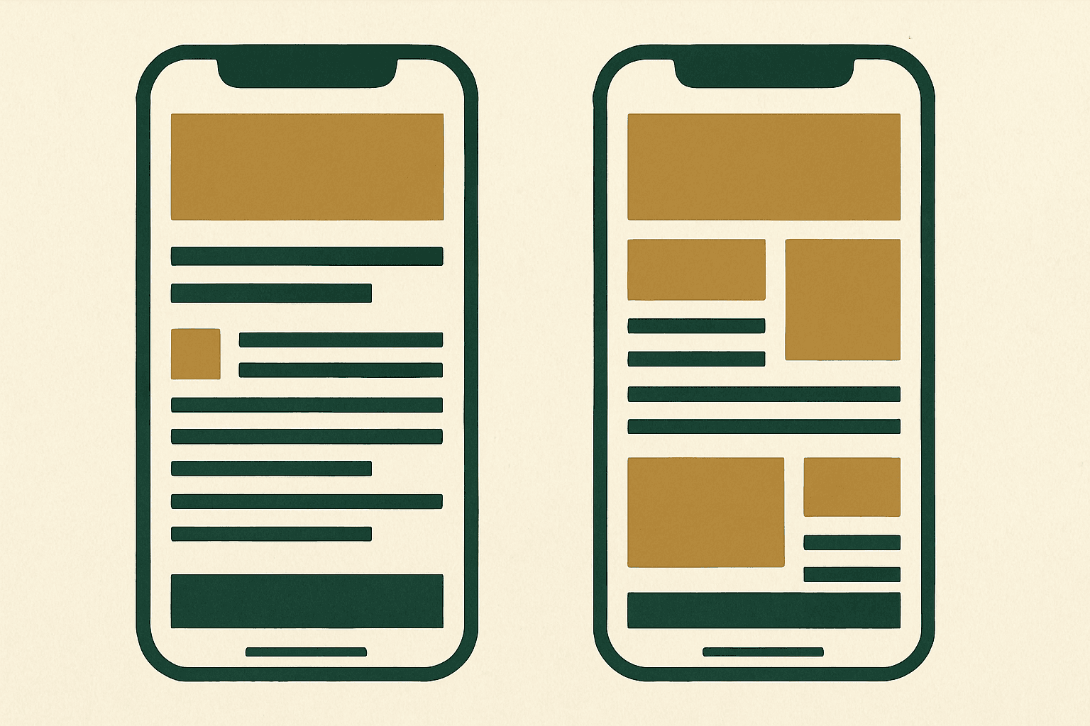
Mobile is where most publishers either make their layout work or ruin it. The best mobile placements are usually simpler than desktop:
- One visible top placement, but not so large that it buries the content.
- In-content units inserted after sections, not every few paragraphs.
- A sticky footer only if it is compliant, easy to dismiss where required, and not disruptive.
- An end-of-article placement before related posts or comments.
On many sites, mobile sticky ads raise viewability and revenue, but they also raise annoyance if they consume too much vertical space. The tradeoff is not theoretical. If users scroll less, read fewer pages, or stop returning, short-term gains can cost you more than they make.
How network choice changes your ad layout strategy
Your network matters because each one has different optimization strengths and traffic thresholds. As of 2026, approximately:
- AdSense: accessible for smaller sites, often the starting point, but manual placement quality still matters a lot.
- Ezoic: useful for testing layouts and combinations, especially once you have enough traffic for meaningful experiments.
- Monumetric: generally aimed at growing publishers with minimum traffic requirements and more hands-on ad management than raw AdSense.
- Mediavine: typically requires significant traffic and a strong content profile; often performs best with cleaner layouts and high-quality in-content inventory.
- Raptive: usually suited to larger publishers with meaningful scale; strong monetization potential, but premium results still depend on niche, geography, and season.
The rough thresholds change over time, but as of 2026, approximately, AdSense is the easiest entry point, Ezoic tends to be available well below premium-network scale, Monumetric usually expects tens of thousands of pageviews, and Mediavine and Raptive generally expect materially higher traffic and content quality. Always verify current requirements directly. The placement principle stays the same either way: high-viewability, non-annoying, mobile-aware slots usually outperform clutter.
RPM expectations from different layouts
No one can truthfully promise a precise RPM from a specific placement pattern. Earnings vary by niche, geography, and season. But in practice, these broad patterns are common:
| Layout style | Typical revenue effect | Typical downside |
|---|---|---|
| Very light ad load | Lower RPM, stronger UX | Leaves money on the table |
| Balanced top + in-content layout | Usually best overall tradeoff | Needs testing to tune spacing |
| Heavy ad density everywhere | May raise short-term RPM | Can hurt engagement and page quality |
| Mobile-first optimized layout | Often strong for modern traffic mixes | Requires careful responsive design |
For informational sites, a balanced layout is usually where the compounding gains are. You may earn a bit less per pageview than the most aggressive possible setup, but if the site loads better, retains users better, and supports higher traffic growth, the total business often comes out ahead.
A simple testing plan for WordPress ad placement
Do not redesign your entire ad layout in one shot. Test a few meaningful changes at a time.
- Start with your current RPM, session duration, pages per session, and Core Web Vitals baseline.
- Test one top placement change first.
- Then test in-content spacing on long posts.
- Review mobile separately from desktop.
- Keep enough data to smooth out weekday and seasonal swings.
- Reject changes that raise revenue slightly but clearly worsen UX or speed.
Mistakes that usually lower earnings over time
- Putting too many ads above the fold.
- Inserting ads before the reader reaches any useful content.
- Using desktop-centric layouts on mobile.
- Ignoring lazy loading, CLS, and render delays.
- Adding low-viewability sidebar units just because there is space.
- Evaluating only RPM and ignoring engagement or traffic trend changes.
- Assuming premium networks can fix a bad layout automatically.
This is where a lot of publishers get trapped. They chase incremental RPM gains with denser layouts, then wonder why search traffic, return visits, or page depth soften over time. A WordPress ad placement strategy should support the content, not compete with it.
The practical default for most publishers
If you want a sensible default ad layout WordPress setup in 2026, use one top placement, two to four in-content placements depending on article length, one optional sticky sidebar for desktop-heavy audiences, and one carefully controlled mobile sticky unit if it truly helps. Then test. That will outperform random slot stuffing on most sites.
If you are building your monetization stack from scratch, go back to the full display ads guide and pair placement decisions with network choice, page speed work, and content length strategy.
What is the best ad placement on a WordPress blog?
Should I put ads above the fold on WordPress?
Are sidebar ads still worth using in 2026?
How many ads should I place in a WordPress article?
Which ad network is best for WordPress publishers?
Get the next guide by email
One practical email when we publish.