
Best Ad Placements for a Website (Without Wrecking UX)
Best ad placements website owners should test first, with UX-safe layouts, viewability tips, and network thresholds as of 2026, approximately.
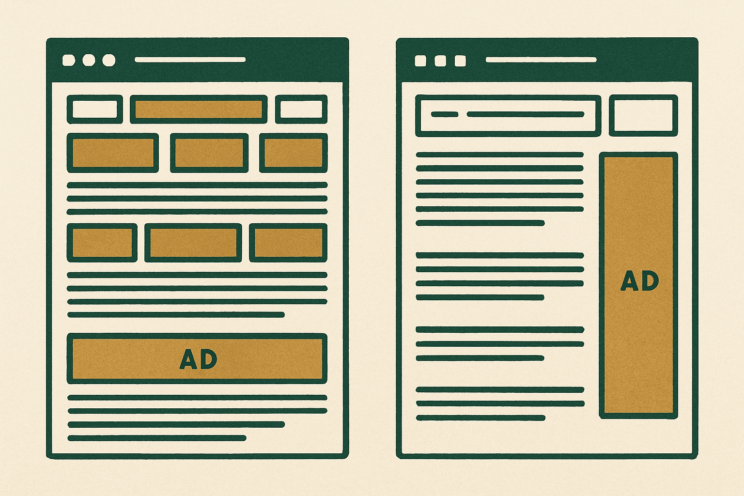
The best ad placements website owners should start with are typically an in-content unit near the top of the article, a second unit after meaningful scroll depth, a sticky sidebar on desktop, and a mobile sticky anchor only if it does not crowd content. That mix usually balances revenue and user experience better than stuffing above the fold ads everywhere. If you need the bigger picture first, start with our display ad monetization guide and then come back to placement testing.

If you only remember one rule, make ads interrupt scanning less than they improve RPM. Good placement is not about the maximum number of slots. It is about putting ads where they are viewable, relevant to reading flow, and unlikely to trigger accidental clicks, layout shift, or fast bounces. In practice, that usually means fewer placements than auto-inserted layouts create by default.
Best ad placements website owners should test first
For most content sites, these are the positions worth testing before anything exotic:
- A leaderboard or responsive unit below the site header and above the main content, not pushed so high that it dominates the first screen.
- An in-content ad after the intro, usually after 2 to 4 short paragraphs, once the reader has committed.
- Additional in-content units every meaningful content section rather than every few hundred words mechanically.
- A sticky sidebar unit on desktop, only when the content column still has breathing room.
- A mobile sticky anchor at the bottom, used carefully because it can help revenue but can also annoy readers.
- A high-viewability unit near the end of strong sections, especially on long guides with deep scroll.
Those placements work because they align with natural pause points. Readers arrive, orient themselves, start reading, pause between sections, and continue. Ads placed at those transitions often produce better viewability and steadier earnings than random placements that slice through paragraphs or crowd navigation.
Where not to place ads
Some placements look tempting because they generate immediate impressions, but they can quietly damage engagement, SEO, and long-term monetization.
- Before your title on content pages.
- Between the headline and byline or between the byline and intro paragraph.
- Directly under navigation if the ad pushes the actual content far below the fold.
- Inside short paragraphs where the ad appears before the reader gets any value.
- As multiple sticky units on the same viewport.
- Near buttons, menus, pagination, or internal links where accidental clicks become more likely.
- In layouts that cause visible layout shift after content starts rendering.
Above the fold ads: useful, but easy to overdo
Above the fold ads are not bad by default. In fact, one well-sized, fast-loading unit near the top often becomes one of the highest RPM placements on the page because it is immediately viewable. The problem starts when the first screen becomes mostly ads, especially on mobile. If a visitor has to scroll before seeing meaningful content, you are usually trading too much UX for short-term yield.
A good working standard is this: the first screen should still feel like a content page, not an ad container. On desktop, a top unit below the header can work well if the headline and at least some of the intro are still visible. On mobile, the tolerance is lower. A tall unit that consumes most of the viewport can suppress engagement quickly.
| Placement | Why it works | Main risk | Best use case |
|---|---|---|---|
| Below header / above content | High early viewability | Can push content down too far | Content sites with clean headers and strong article intros |
| After intro paragraphs | Good balance of attention and low friction | Can feel abrupt if too early | Articles, tutorials, guides |
| Mid-article section break | Natural pause point | Too many units can reduce reading momentum | Long-form editorial content |
| Desktop sticky sidebar | Often strong viewability on wide screens | Crowded layout on narrow content areas | Desktop-heavy sites with clear sidebar space |
| Mobile bottom anchor | Persistent visibility | Irritation and reduced usable screen space | Carefully tested mobile traffic with strong session depth |
| End-of-article unit | Captures deep readers | Lower traffic reaches it on short sessions | Long guides and comparison pages |
The ad layout patterns that usually perform best
1. Content-first article layout
This is the safest default for SEO and user experience. You keep the title, intro, and first section mostly clean, then introduce the first ad after the reader is engaged. A typical pattern is one top unit below header, one after the intro, one around the middle, and one near the end. If you use a sidebar, make it supportive, not dominant.
2. Desktop sidebar plus lighter in-content density
If your audience is desktop-heavy, a sticky sidebar can carry a surprising amount of revenue by itself. That often lets you reduce in-content interruptions. This is one of the cleaner ad layout options for B2B, software, finance, or reference content where readers stay on screen longer and use larger monitors.
3. Mobile-first article with restrained anchors
For mobile-majority traffic, in-content placements usually matter more than side rails for obvious reasons. Here, the winning pattern is often one modest top unit, one unit after the intro, one or two deeper section units, and a carefully tested bottom anchor. The anchor should never make dismiss controls hard to use or cover key page elements.
How many ads is too many?
There is no universal number because niche, device mix, page length, geography, and network setup change the economics. But the practical answer is simple: you have too many ads when the next unit lowers session quality faster than it raises page RPM. Watch scroll depth, pages per session, bounce trends, return visits, and especially revenue per user, not just revenue per pageview.
On short posts, aggressive insertion usually backfires. On long guides, more units can be justified if they line up with real section breaks. A 700-word page should not look like a 3,000-word monetization guide. Match ad density to content depth.
Viewability matters more than sheer slot count
A hidden truth in display advertising is that low-quality placements often create lots of ad requests and weak earnings. High-viewability placements tend to win more competitive bids. That is why a smaller number of strong positions can outperform a page cluttered with low-attention units.
The placements that usually produce healthy viewability are near content starts, at section transitions, and in sticky desktop sidebars that remain visible without blocking content. The placements that underperform are often buried below weak content, stacked too close together, or loaded in areas users never meaningfully see.
Best placements by page type
Blog posts and tutorials
Use one top unit, one post-intro unit, one or two section-break units, and optionally an end unit. Desktop sidebar sticky can work well if the layout supports it.
Long-form evergreen guides
These can support more in-content placements because readers naturally pause between sections. Just make sure each ad follows a substantive chunk of content, not every heading mechanically.
Forums or UGC pages
Be careful. Thread pages can become messy quickly. Ads often work better between content blocks or after the first meaningful interaction than at the very top where they can suppress participation.
Tools and utility pages
Protect the workflow. Avoid placing ads too close to inputs, results, or primary actions. A top banner and lower-page units usually make more sense than interrupting the tool itself.
Network context: what placements different ad stacks can support
Your network affects what is realistic. As of 2026, approximately, Google AdSense is still the easiest starting point for smaller sites, though earnings typically vary by niche, geography, and season. Ezoic is often considered once a site has enough traffic to benefit from testing and mediation. Monumetric is usually discussed for growing publishers in the low tens of thousands of monthly pageviews, approximately, depending on plan and availability. Mediavine commonly enters the conversation around 50,000 sessions per month, approximately, while Raptive is usually associated with larger publishers around 100,000 pageviews per month or more, approximately, though exact requirements and acceptance standards can change.
Why this matters for placement: premium managed networks often help with optimization, but you still need judgment. Auto-placement can be a useful baseline, not a final answer. If a network inserts ads too aggressively around your strongest content, your job is to dial it back and protect the page.
Expected earnings from better placements
You should expect placement changes to influence RPM more than many site owners realize, but not in a perfectly linear way. Better placement can improve viewability and auction pressure, which can lift page RPM. Still, earnings vary by niche, geography, and season. As of 2026, approximately, broad display RPMs might range from low single digits on lower-value traffic to much higher ranges on premium niches and top-tier geographies. The point is not to chase a universal benchmark. It is to improve the quality of your inventory.
A cleaner page with stronger viewability can sometimes beat a cluttered page even if the cluttered version serves more impressions. That is why placement testing should focus on revenue per session or revenue per user where possible, not just raw ad impressions.
Protect Core Web Vitals while testing ad placement
Bad placements do not just annoy users. They can also hurt rendering, stability, and page speed. Reserve space for ad containers, avoid injecting large units above existing content after load, and be careful with sticky behavior on mobile. If you want the technical side, read our guide to ads and Core Web Vitals before rolling out aggressive new layouts.
- Pre-allocate container dimensions where possible to reduce layout shift.
- Do not stack multiple heavy units at the top of the page.
- Lazy load lower-page ads, but avoid breaking viewability for near-viewport placements.
- Check mobile usability after enabling sticky or anchor formats.
- Test on slower devices, not just your desktop.
A simple testing plan that actually works
Do not test six variables at once. Start with one layout change, run it long enough to smooth out weekday and weekend noise, and compare against a meaningful baseline.
- Pick one page template, not the whole site.
- Record baseline metrics: page RPM, revenue per session, bounce rate, scroll depth, pages per session, and ad viewability if available.
- Change one thing first: for example, move the first in-content ad lower.
- Run the test through normal traffic cycles.
- Review both revenue and engagement, not just ad earnings.
- Keep the winner, then test the next variable.
Recommended starting layout by traffic level
| Site stage | Suggested starting placement mix | Notes |
|---|---|---|
| Early-stage site | One top unit, one post-intro unit, one end-of-article unit | Keep layout simple while building traffic and trust |
| Growing content site | Top unit, post-intro, one or two section-break units, desktop sidebar sticky if suitable | Focus on viewability and template consistency |
| Established long-form publisher | Top unit, multiple section-break units on long pages, sidebar sticky, selective mobile anchor | Use testing and monitor UX closely |
The practical rule of thumb
Put ads where attention naturally pauses, not where they interrupt orientation. Keep one strong above-the-fold opportunity, use in-content placements at genuine section transitions, add a desktop sticky sidebar when your layout supports it, and treat mobile anchors as optional rather than mandatory. That is usually the best ad placements website owners can rely on across most content sites.
If your monetization plan still feels fuzzy, go back to the full display ads guide and map placement decisions to your traffic stage, device mix, and network options.
What is the best ad placement on a website?
Are above the fold ads bad for SEO or UX?
How many ads should I put on each page?
Should I use sticky ads on mobile and desktop?
Get the next guide by email
One practical email when we publish.